
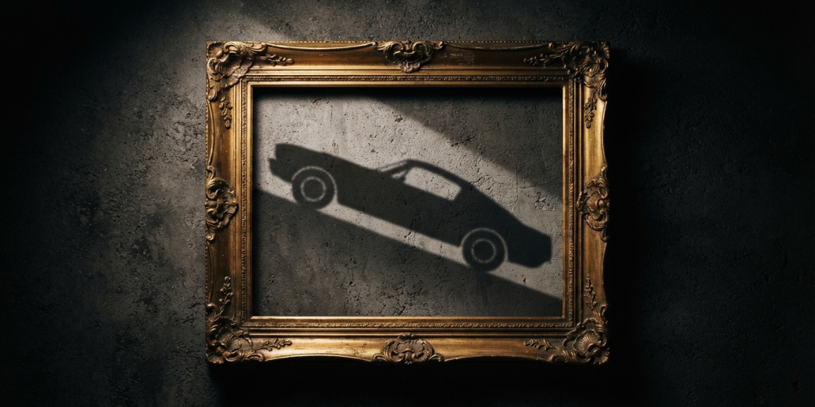
Every premium brand builds something more than a product over time - it builds a set of expectations. The moment a new product struggles to meet them reveals everything the design brief did not define. No launch in recent memory has demonstrated this more clearly than the Ferrari Luce.
Ferrari Luce - developed over several years with LoveFrom, the design collective founded by Jony Ive and Marc Newson - should have been a straightforward triumph. It arrived as Ferrari's first fully electric production car and one of the most closely scrutinized automotive launches of recent years. Yet within hours of the unveiling on 25 May 2026, the conversation had moved away from engineering entirely. Critics questioned whether the car still felt like a Ferrari.
That reaction is what makes the Luce relevant far beyond the automotive world. This is not just a story about EVs or luxury brands. It is a case study in brand identity in product design - and in what happens when a company pushes a product into a new era without fully preserving the cues that gave the brand meaning in the first place. The backlash was not mainly about performance, even though the Luce launched with serious technical credentials: a 122 kWh battery on an 880-volt platform, quad-motor power delivering 1,035 horsepower, and a cabin built around tactile controls rather than the now-standard oversized touchscreen.
Much of the criticism focused elsewhere - on recognition, stance, visual language, and emotional continuity rather than specs. That distinction points to a broader truth about premium products: customers do not buy the product alone. They also buy what the brand has taught them the product should feel like, signal, and stand for.
.png)
What Brand Identity in Product Design Really Means
Kevin Lane Keller's foundational work on customer-based brand equity defines it as the differential effect of brand knowledge on how consumers respond to the marketing of that brand - in short, the accumulated meaning a name carries that shapes perception independently of the product's objective attributes. In practice, that means people rarely buy performance, features, or usability alone. They also buy recognition, trust, familiarity, symbolism, and the accumulated expectations a brand has built over time.
Applied to a brand like Ferrari, this means that the emotional premium customers are willing to pay is not intrinsic to the vehicle - it is constructed through decades of consistent signals. Disrupting those signals does not just risk the product; it risks the equity the brand has spent years building.
That is why brand identity in product design cannot be treated as a cosmetic layer applied at the end. It is not limited to logos, colors, or surface finishes. It includes the visual, tactile, acoustic, and behavioral cues that help customers recognize a product as belonging to a specific brand almost instantly.
Ferrari is a particularly clear example because it has built its identity with unusual consistency over time. Even people who will never own one tend to know what a Ferrari is supposed to communicate: speed, drama, aggression, craftsmanship, and a kind of mechanical intensity that has become part of the brand's mythology. At that point, the badge stops functioning as a simple identifier and starts operating as a promise.
Promises, however, create design constraints. A company can evolve its products, enter new categories, and reinterpret its design language - but it cannot ignore the expectations shaped by decades of brand-building. When it does, even a technically impressive product can feel disconnected from the brand that is supposed to give it meaning.
Reading the Luce Reception
Ferrari did not treat the Luce as a side project. The company spent years developing it with LoveFrom and positioned the car as a serious statement about Ferrari's electric future, not a reluctant compliance move. Ferrari's decision to pursue a new audience with a radically different product format was a considered strategic call - and that is precisely what makes it such a useful design case study. LoveFrom's remit appears to have extended across both exterior and interior - and the contrast between the two is telling. The interior received consistent praise for its emphasis on physical controls, crafted materials, and a tactile interaction model that deliberately pushed back against the touchscreen-heavy norm in EV design. The exterior, particularly the tall glass house profile and coach-entry doors, generated the most discussion about brand continuity.
This matters beyond visuals. The acoustic dimension - one of Ferrari's most immediate identity signals for decades - is also fundamentally altered by full electrification. Ferrari's decision to amplify real mechanical vibrations from the electric axles rather than use synthetic sound shows the identity question was at least partially addressed. But when a cue this central disappears, it raises the stakes for every remaining signal - especially the visual ones.
On paper, the interior approach makes clear sense as a brand identity decision. But iconic products are never judged in isolation - they are judged against the brand behind them. Reuters reported that critics and investors reacted coolly to the reveal, questioning whether the Luce remained true to Ferrari's identity, while the company's shares fell by more than 8 percent on the day. CNBC reported that the design shift triggered clear investor concern - though it is worth noting that Ferrari's shares had already been under pressure in the months prior, amid broader luxury market headwinds.
What the criticism was actually about is worth examining carefully. Commentators did not dismiss the Luce as incompetent or under-engineered. Many acknowledged the interior as genuinely thoughtful. They argued, rather, that the car as a whole did not feel Ferrari-like enough. Suggested wording: Former Ferrari chairman Luca di Montezemolo went further, stating: 'We risk the destruction of a legend. I hope they at least remove the Prancing Horse from it.' That is not a styling complaint. That is a brand legitimacy challenge - and it is the kind of signal worth understanding regardless of how the Luce performs commercially.
Who Is the Luce Actually For?
The most revealing moment of the entire launch may have come from Ferrari's own leadership. Ferrari's Chief Marketing and Commercial Officer, Enrico Galliera, told the Financial Times - a statement reported across multiple outlets - that the Luce was never designed for existing Ferrari customers: "To my petrolheads that I meet, I always tell them, please don't buy the Luce." The target buyer, he explained, is someone who already owns an electric car - not someone who already owns a Ferrari.
That is a significant strategic admission. Ferrari was not designing for its existing audience. It was designing for a new one: technology-sector entrepreneurs, younger affluent buyers more comfortable with EVs, and markets with strong electric vehicle adoption. Ferrari CEO Benedetto Vigna reinforced this, defending the €550,000 (approximately $630,000) price tag and pointing to strong interest from newly affluent buyers in these markets. Management framed the Luce as an additive range model designed to expand the customer base - not replace the existing one.
The ambition is understandable. Ferrari clearly recognized that its traditional buyer base is not growing fast enough to sustain the company's next decade, and that the shift to electrification is an opportunity to reach a different kind of wealth: newer, younger, and more globally distributed.
The harder question is what that strategy produced when translated into product form. The Luce is a four-door, five-seat liftback - the second four-door Ferrari ever built (after the Purosangue, launched in 2022), but the first in the company's history capable of seating five passengers simultaneously. It rides on 23 and 24-inch wheels, features coach-entry rear doors, and presents a tall, shell-like silhouette that prompted comparisons to less sporty vehicles across a wide range of automotive commentators. Some of those comparisons were hyperbolic. But the consistency of the response across diverse audiences - not just Ferrari loyalists - points to something structural rather than merely sentimental.
That gap between strategic intention and the audience's reading of the design is worth examining. Ferrari had clearly defined who it wanted to attract. The brief, however, raises the question of whether it fully answered a harder follow-up: what must this car still look like, feel like, and communicate to remain unmistakably Ferrari - even for someone who has never owned one before? A buyer new to the brand does not arrive without expectations. They arrive with decades of cultural context about what a Ferrari is supposed to be.
Perhaps the most instructive commercial detail came after launch. Bloomberg reported that Ferrari has been positioning Luce orders as a form of loyalty signal, suggesting that buying one may help existing wealthy clients preserve access to more desirable future models. Ferrari subsequently denied this, with CMO Enrico Galliera calling such an approach a "huge mistake." Whether commercial incentives are being applied informally remains contested. What is clear is that the Luce has not yet entered production, and the response from its intended new audience - rather than the existing Ferrari community - has not yet been fully measured.
A Pattern Across Industries
The Luce is not unusual in this regard - it is the latest iteration of a pattern that repeats whenever a brand prioritizes transformation over recognition. The industries and products differ significantly; the underlying dynamic does not.
Take Tropicana's 2009 packaging redesign. PepsiCo replaced the iconic orange-with-a-straw packaging with a cleaner, more minimal design - and sales reportedly dropped by approximately 20 percent in the weeks that followed, with some estimates placing the revenue loss at $30 million or more before the company reversed course. The challenge was not that the new packaging looked worse. Customers no longer recognized it as quickly on the shelf, and one of the brand's most important visual cues had quietly disappeared.
.png)
Gap encountered something similar in 2010. The company replaced its familiar blue-box logo with a more generic wordmark, then reversed the redesign after just six days in response to public reaction. The speed of that reversal showed that people were not responding to a minor stylistic update - they were responding to a signal that the brand no longer understood what made it recognizable.
New Coke remains one of the clearest illustrations. Coca-Cola reformulated its flagship product after taste tests suggested consumers preferred the new version, yet the response was strong enough to bring the original formula back - as Coca-Cola Classic - after just 79 days. The company had optimized around taste while underestimating attachment, memory, and the sense of symbolic ownership customers felt toward the original.
Across very different industries, the dynamic is strikingly consistent:
- The change is framed internally as modernization or necessary progress
- The execution is often competent - and sometimes excellent
- Customers experience the change as removal rather than improvement
- What shifts is not preference alone, but continuity, recognition, and trust
The Luce may or may not follow this trajectory - it is still early, and Ferrari's market position gives it meaningful resilience. But the pattern is worth understanding before the outcome is known, because the brief decisions that create identity risk are made long before launch day.
Where the Challenge Usually Originates: The Design Brief
When a redesign generates criticism on identity grounds, styling often draws attention first. In most cases, the challenge originates earlier - in the design brief.
A brief that leaves brand objectives vague typically defines the business case in detail while underspecifying the identity case. It may cover price, timeline, market segment, and technical requirements, yet describe identity using terms like "premium," "modern," or "innovative." For products carrying meaningful brand equity, that is not enough. A strong design brief has to translate brand DNA into clear, usable design constraints.
That means defining which cues are non-negotiable and which can evolve. It means clarifying whether the product is extending the brand, reframing it, or deliberately targeting a new audience. And it means identifying what customers still need to recognize instantly, even when the product changes in material ways.
The Ferrari Luce raises the question of whether the brief fully addressed this. Ferrari clearly knew it was taking a significant strategic step by moving into a five-seat, fully electric product aimed at a somewhat different buyer profile. Once that shift is acknowledged, a harder question follows: what had to remain unmistakably Ferrari for the move to work?
This becomes even more important when outside partners are involved. External design teams face the greatest difficulty not when they lack capability, but when the identity problem has not been defined with enough precision. When a product generates widespread discussion about brand continuity despite involving highly capable designers, it usually points to one of three conditions: the brief left identity cues ambiguous; it was clear and the company chose to depart from them deliberately; or both parties understood the identity tension and made a considered strategic bet that a new audience would engage without being shaped by the old brand mythology. If the last is true, the key question becomes whether that audience assumption was stress-tested rigorously enough before the bet was placed. In all three cases, the brief is where the choice needed to become explicit - because once concept work begins, retroactively defining what the product must still mean becomes exponentially harder.
How to Protect Brand Equity During Product Evolution
For companies planning a redesign, launching a next-generation platform, or entering a new product category, the goal is not to freeze a product in time. The goal is to evolve it without erasing the cues that make it recognizable.
A few principles tend to matter most:
- Define the non-negotiable recognition cues before concept work begins
- Separate audience expansion from identity shift - these are different strategic decisions that require separate answers in the brief
- Treat visual recognition as a functional requirement, not just an aesthetic preference
- Test with loyal customers, not only internal stakeholders
- Write the emotional brief as carefully as the technical one
That last point is often where the process breaks down. Technical briefs define tolerances, certifications, materials, and performance targets with precision. Emotional briefs - when they exist at all - tend to describe feelings in adjectives: "premium," "exciting," "timeless." The discipline is to translate those adjectives into observable design decisions: which proportions signal aggression rather than approachability, which materials signal craft rather than efficiency, which interactions signal precision rather than simplicity. Until the emotional brief is as specific as the technical one, it cannot function as a constraint.
Tropicana, Gap, New Coke, and the early reception of the Ferrari Luce all illustrate what tends to follow when a significant identity shift is not fully compensated for elsewhere in the design - regardless of how strong the underlying product is.
When the badge does the selling, the product still has to earn the badge. Branding alone cannot explain why a product belongs to a company; design has to do that work.


Schedule an initial talk and get to know us better! You already have a basic brief? Send it over so we can have a more productive first meeting!
a meeting
