
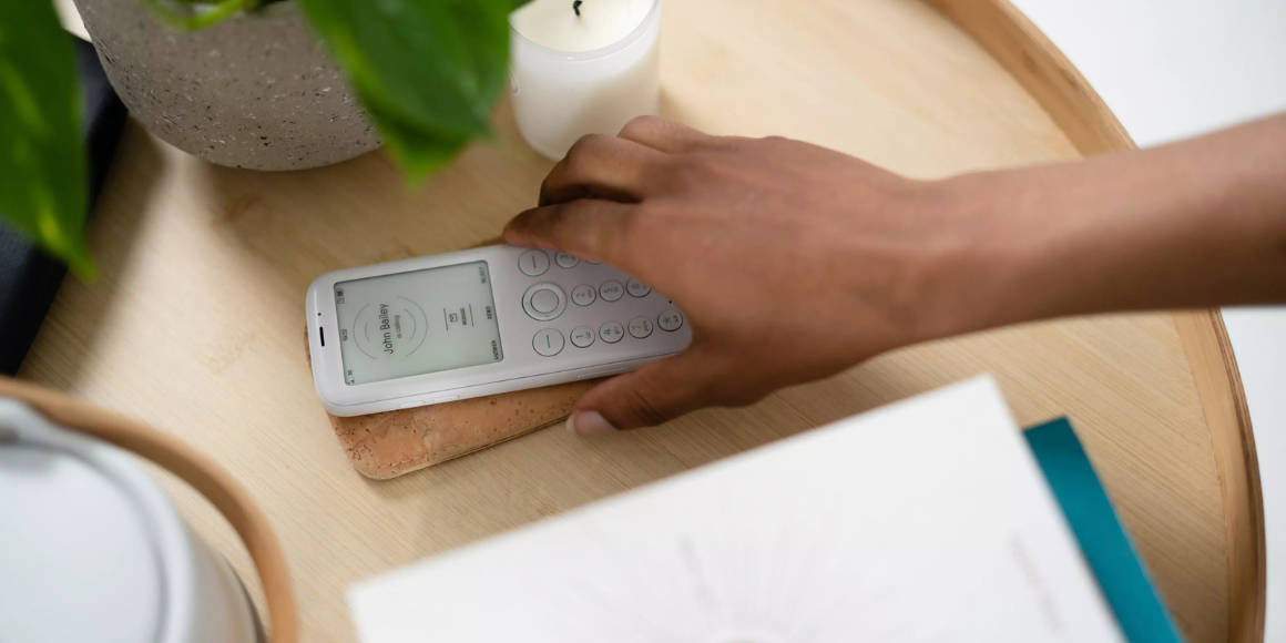
Most of us know the feeling of picking up a phone to check one thing and putting it down twenty minutes later. Some designers choose a different direction and create products that do not compete for every available moment of our time.
In this article, we explain what calm technology is, where the idea came from, and why it should not be confused with plain minimalism. We look at four specific products, starting with a project we know inside out: the Mudita Pure phone. Working with Mudita, we developed its final form, planned its mechanical design, and tested its ergonomics. We close by explaining how Calm Tech certification works and what the badge can and cannot tell you.
What Is Calm Technology?
Calm technology is a design approach that works with human attention instead of constantly competing for it. A product designed in this spirit communicates necessary information without demanding full focus at all times. During routine use, it stays in the background and moves to the center of attention when the situation genuinely calls for a response.
In Weiser and Brown's account, the idea depends on two ways of engaging attention:
- The periphery of attention (background): information we remain attuned to without focusing on it consciously. Examples include the steady sound of a car engine while driving or a clock visible on the wall.
- The center of attention (focus): information and tasks on which we consciously focus our perception and thought.
Well-designed calm technology lets information move from the periphery to the center of attention and back again. A signal stays in the background until it requires action. When it becomes important, it should be easy to notice and understand.
The Origins of Calm Technology
The idea predates the modern smartphone. In 1995, Xerox PARC researchers Mark Weiser and John Seely Brown published Designing Calm Technology. A year later, they expanded these ideas in The Coming Age of Calm Technology. They described technology that engages both the center and the periphery of attention and moves information smoothly between them.
Researcher and designer Amber Case later translated the concept into eight practical design principles, now published by the Calm Tech Institute. They are not laws of psychology or a guarantee that a product will be effective. They are heuristics that help teams examine how technology manages a user's attention. Three are especially relevant to our work:
- Require the smallest possible amount of attention.
- Make use of the periphery.
- Use the minimum technology needed to solve the problem.
Is Calm Technology Just Minimalism?
Not quite. For the purposes of this article, we use minimalism to mean reducing visual and functional elements: using simple geometry, a restrained palette, a clear hierarchy, and removing features that do not support the product's main purpose. Calm technology asks a different question: how much attention does the product require, when does it require it, and how quickly does it allow the user to return to the task that matters?
The two approaches often overlap, as they do in Mudita Pure, but neither automatically produces the other. A visually austere interface can still rely on frequent, intrusive notifications or an endless stream of content. Conversely, a product with a richer visual form can behave calmly if it stays in the background and brings information to the center of attention only when justified.
Four Examples of Calm Technology
1. Reducing Features: Mudita Pure
Principle: use the minimum technology needed to solve the problem.
One way to reduce the number of reasons someone reaches for a device is to reduce its features deliberately. This was the approach the Mudita brand took when creating the Mudita Pure phone. Working with the Mudita team, we were responsible for developing the device's final form, its construction, and the ergonomics of use.
Developing the final form took 18 months and involved several dozen design iterations. We used visual and mechanical prototypes to develop and optimize the form, ergonomics, and construction. One of our key tasks was integrating the screen smoothly into the body while meeting the required durability standards, so that we could achieve the form defined in the concept phase. The whole development process also had to account for limiting signal emission, an important feature of this product.
This process illustrates an important aspect of calm technology: a simple, unobtrusive result can require intensive design, prototyping, and engineering. The simplicity the user sees does not mean the development process was simple.
Mudita Pure has a front-lit E Ink display and a physical keyboard. It has no camera or browser, and its operating system does not support installing third-party apps. A side switch lets users move between Connected mode, a configurable Do Not Disturb mode, and Offline mode without navigating a menu. Pure is not intended for browsing the web on the phone itself, although it can share its connection with a computer as a USB modem. Mudita presents the absence of a browser as a way to support offline life: going online is meant to be a planned decision rather than an unthinking reflex.
.png)
Japanese and Scandinavian influences: when designing Mudita Pure, we combined inspiration from Japanese and Scandinavian design traditions. In the form we developed, the Japanese references show up in restraint and visual calm, while the Scandinavian ones show up in simplicity, ergonomics, and the subordination of form to function. Mudita also draws on Zen aesthetics, nature, and a stone-like shape. The inspirations supplied by the client served as reference points rather than a rigid set of rules.
Trade-off: without a browser or an app ecosystem, mobile banking, advanced navigation, messaging apps, and some other services may require an additional device or an alternative way of doing things. Reducing stimuli therefore comes at the cost of limiting the range of tasks you can do directly on the phone.
2. Information in the Background: Invisible Display
Principle: make use of the periphery.
Information does not have to interrupt what we are doing with a pop-up or a vibration. It can remain in the environment until we choose to look at it.
Invisible Display is a 7.5-inch electronic-paper calendar in a hand-finished wooden frame, designed to hang on a wall or stand on a desk. Created by the German company Invisible Computers, it presents a schedule without a backlight or an accompanying stream of content. A glance can replace unlocking a phone simply to check whether Wednesday is free.
Trade-off: the device is not entirely self-contained. Initial setup and configuration require a mobile app for iOS or Android, and the schedule syncs with Google Calendar. Users who want to reduce their dependence on the manufacturer's infrastructure can use the documented local render server. The Calm Tech Institute also describes the option of pointing the display to a server on your own network. That option requires technical knowledge, so it is not the default experience for every user.
3. An Interface That Disappears into the Material: mui Board Gen 2
Principle: require the smallest possible amount of attention.
A permanently illuminated screen can attract attention unnecessarily. Japan's mui Lab took the opposite approach with mui Board Gen 2, a smart-home controller embedded in a wooden panel. Illuminated icons and messages appear when the surface is touched. At rest, as The Verge described it, the device resembles a piece of wood mounted on the wall.
For industrial designers, it is an interesting example of a material becoming part of the interface rather than merely housing the electronics. When messages disappear at rest, the device can sit within a domestic interior more easily than an always-on screen. Natural material alone does not make a product calm, however. System behavior, information hierarchy, and configuration matter as well. This is our design interpretation, not a universal rule.
Trade-off: initial setup and some functions depend on a mobile app, while smart-home control depends on compatible devices and integrations. The interface can therefore remain calm in routine use, even though configuring and extending the wider system still demands the user's active attention.
4. A Narrow Range of Tasks: reMarkable Paper Pro
Principle: use the minimum technology needed to solve the problem.
A calm product does not have to perform only one function. It can support a narrow set of related tasks while rejecting features that do not serve its main purpose. This is our interpretation of the principle, not a separate rule proposed by Amber Case.
reMarkable Paper Pro is a tablet with a color paper-like display, designed primarily for handwriting, reading, and organizing documents. As IEEE Spectrum reported, it has no app store, browser, or widgets and does not even display the time in the workspace. In late 2024, it received Calm Tech certification. According to reMarkable, it was the first tablet with a paper-like display in the world to earn the certification.
Trade-off: a specialized tablet does not replace a conventional computer for most office tasks. It can synchronize documents online, and transferring or continuing work on other devices relies on apps and services in the reMarkable ecosystem.
Why Might Calm Technology Work?
The sources cited here do not show whether these four products actually reduce screen time or how often users reach for a device. They do, however, suggest two design mechanisms that may reduce unnecessary demands on attention.
Fewer entry points: Nir Eyal's Hook Model describes a four-stage cycle of product engagement: trigger, action, variable reward, and investment. It is a practical product framework, not evidence that the products discussed here change user behavior. It can nevertheless help identify engagement mechanisms that some of them omit. A wall calendar does not provide a content feed built around variable rewards, while a phone without a browser, social apps, or infinite scrolling creates fewer opportunities for repeated checking. This does not demonstrate a behavioral effect. It shows only that the product architecture removes some common entry points into habitual use.
Information in the periphery: a well-designed signal can maintain situational awareness without forcing an immediate task switch, as Weiser and Brown argued. Not every subtle signal is effective, however. Designers need to match its intensity, modality, and timing to the importance of the information, then test whether users notice and interpret it correctly. Urgent information should move unmistakably to the center of attention.
The paradox: buying another electronic device to escape technological overload may sound contradictory. What matters, however, is not only the number of devices but how each one manages attention: whether it performs a defined task and recedes, or continually encourages another interaction. This is a design perspective, not a measured outcome for the four products.
.png)
When Subtlety Is Not Enough
Calm technology does not mean that every signal should be quiet or discreet. In critical situations, a system should move information decisively from the periphery to the center of attention. In smoke alarms, medical devices, machine controls, and vehicle-safety systems, alerts must be appropriate to the urgency, risk, users, and conditions of use.
Relying only on a subtle light, a single sound, or one sensory channel can lead to missed warnings and may exclude users with visual or hearing impairments. In high-risk applications, alert design should follow risk analysis, user needs, and the relevant industry standards. Depending on the context, that may require multiple communication channels, alarm priorities, or redundant signals.
The design question is therefore not, "How can we make this product quieter?" but, "How much attention does this information require right now?" A mature product can remain in the background during routine use and deliver an immediate, unambiguous message in an emergency.
What Is Calm Tech Certification?
Amber Case launched the Calm Tech Institute in May 2024. The institute evaluates submitted products against an 81-point framework spanning six areas: attention, periphery, durability, light, sound, and materials. Its publicly described process includes a product review, a report identifying strengths and opportunities for improvement, and a certification decision. Institute materials use three levels of recognition: Certified, Gold, and Platinum.
In January 2025, IEEE Spectrum reported that the full specification was not publicly available, although the publication had received a copy for review. At the time of writing, the institute publicly described the scope and general process of the audit but did not provide the complete scoring matrix or the thresholds for each certification tier. This limits the ability of people outside the certification process to reproduce a product's result independently.
The institutional model also matters. The Calm Tech Institute develops the criteria, conducts the audit, and awards its own badge, while also offering workshops and a pre-certification program. The certificate is therefore a structured assessment of a product against the institute's framework. It does not replace independent usability or accessibility testing, nor does it prove an effect on user behavior.
Certification can be confirmed for three of the four products discussed here: Invisible Display, mui Board Gen 2, and reMarkable Paper Pro. At the time of writing, we found no public confirmation that Mudita Pure had received Calm Tech certification. In 2025, Mudita's newer Kompakt phone received the highest level, Platinum, as did the Mudita Harmony 2 and Mudita Bell 2 alarm clocks, which also appear on the institute's list of certified products.
Developing a Physical Product with Calm Technology in Mind?
Not every product should be disconnected, radically simplified, or made quieter. Every project should, however, define consciously when it requires the user's attention and when it should remain in the background.
If you are looking for a balance between advanced technology and an unobtrusive physical form, talk to us about your idea. We take projects from early concepts through industrial design, mechanical engineering, and prototyping to preparation for series production. For an overview of the process, read our guide to what product design involves.



Schedule an initial talk and get to know us better! You already have a basic brief? Send it over so we can have a more productive first meeting!
a meeting
